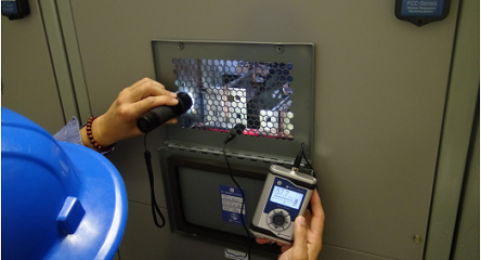
In recent years the abundance of digital data about enterprise assets enables the development, deployment and operation of data-driven solutions for managing assets in intelligent ways. The latter result in improved reliability, as well as minimization of failures and costs. In this direction, enterprises spend time and effort in designing and integrating Intelligent Asset Management (IAM) solutions that collect and analyse large volumes of digital data, including for example data from vibration sensors, thermal images, ultrasonic sensors, acoustic devices, temperature sensors, power consumption sensors, oil analysis systems, as well as data from business information systems (e.g., Enterprise Resource Planning (ERP) systems) and quality management systems (e.g., Computerized Maintenance Management Systems (CMMS)). The tasks of collecting and consolidating data from heterogeneous sources is extremely challenging given the need to cope with different interfaces, formats and semantics. Likewise, finding useful patterns and extracting knowledge from large volumes of data requires quite tedious and time-consuming data mining processes.
Nevertheless, these challenging tasks won’t provide useful and actionable insights to enterprises, unless their outcomes are properly visualized. Therefore, enterprises need to invest on proper visualization techniques, which will deliver the extracted IAM insights in ergonomic and user-friendly ways to various end-user groups such as maintenance engineers, process engineers, plant managers and the business management of the enterprise. Fortunately, the on-going digitization of the shopfloor, coupled with advances in data visualization (e.g., Big Data visualizations and Augmented Reality) provides unprecedented opportunities for visualizing IAM insights in effective ways. In this context, enterprises must select the most appropriate visualization techniques for their IAM tasks.
Dashboards and Reports
Dashboards are the most commonly used modality for visualizing information about enterprise assets. All Big Data analytics platforms for IAM, including SAP’s IAM solutions provide the means for developing and customize dashboards that display assets’ insights and other relevant information. In most cases a dashboard comprises multiple charts and reports about individual assets or entire groups of assets. In their simplest form, these dashboards display static or dynamic information in appropriate widgets and charts. Some typical examples include:
- Charts that display the most used assets, along with information about their actual usage and predictions about their anticipated usage within specific time windows. These charts may also include reports that track the status of the asset (e.g., its usage) over time.
- Widgets that display alerts when condition parameters of certain assets exceed given thresholds.
- Compliance auditing reports that provide information about whether an asset or a group of assets comply with a set of requirements. The latter requirements may stem from some safety regulation or some corporate policy about the asset.
- Insights about the lifecycle of the asset (e.g., the evolution of its life expectancy), including alerts for scheduling maintenance and repair operations. For instance, if the temperature and rotation speed of an asset exceed predefined levels, an alert can be produced on an operator’s dashboard to allow him/her address the issue proactively.
- Visual representations of recommendations about corrective actions to be taken on assets that are likely to fail. Such recommendations could be depicted over a digital representation of the asset.
- Heatmaps of real-time information about the assets’ condition, which can provide easy to understand insights about the usage of the assets.
- Information on maintenance schedules about one or more assets, which are conveniently displayed and disseminated to users in charge of their monitoring and service processes.
Dashboards comprise a wide array of different charts, including conventional line and pie charts, but also other visualizations that are useful for visualizing very large datasets. Indeed, most IAM applications require visualizations of large volumes of data based on more specialized charts like box plots, stream graphs and donut charts. For instance, box plots (also known as “Box and Whisker” diagrams) comprise “whiskers” i.e. lines used to illustrate variability outside the upper and lower quartiles. Box plots are drawn either vertically or horizontally and provide the means for illustrating outlier values through individual dots. Hence, Box Plots enable visualization of very large datasets in ways that use much less space when compared to histograms or density plots. As such, they can be effective in summarizing information about the number of defects on a product or the number of failures of specific machines and tools over large time periods. As another example, donut charts are like the popular pie charts, but with an area of their centre cut out. Donut charts facilitate the comparison of multiple pie charts together, as they de-emphasize the use of the central area and allow their readers to focus more on reading the length of their arcs. Hence, they are also more space efficient than conventional pie charts, as their central area can be used to display additional information.